
Concept and Overview
AU.ADL & Me is a website face to the group of people who interested to other countries. someone who like natural landscapes; someone wants know the study abroad life in Australia. For them the media is just a tool let them know some news/things happen around the world, so this website gave them a quick way to know some interest things happen in Australia. The website also for someone who live in northern hemisphere, like the people in Asia, North America.
Due to the movement of the plate, Australia’s nature environment is very different with any other country in the world, which also effect Australia unique flora and fauna. There are tens thousands of people came to Australia each year to enjoy the natural scenery in Australia, and what this site doing is to introduce Australia from the version of an international student.
In general, this site is divided into five parts, it clearly seperate between Australian diet, humanities and nature. The design of the website cover around the minimalist style, using the least amount of text on the homepage to condense the specific functions of each part.
Visual Communication and Design
Regarding the design style of this website, I used a vertical template to present my specific content. In the vertical template website, the selection of the navigation bar and the head background image is the most important things of your website, the design of the head layout just like the soul of a person, the connotation and interest of this ‘soul’ directly affects whether people like it or not.
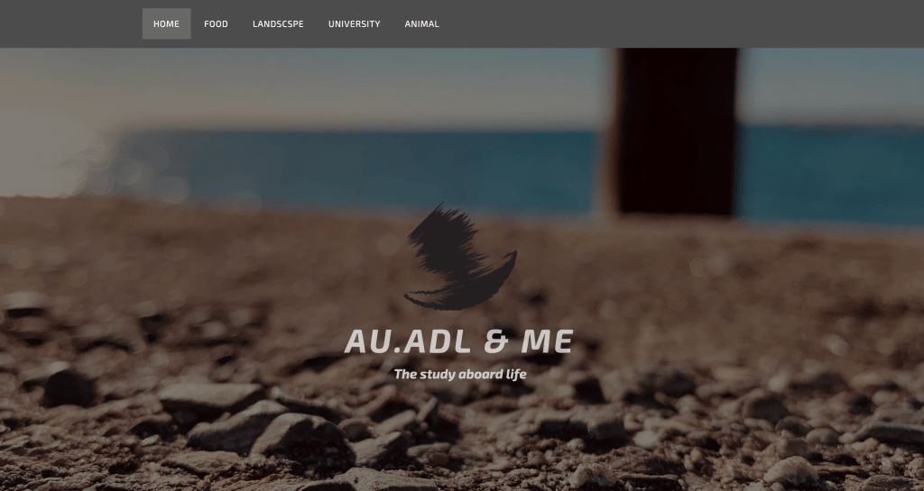
To suit my theme and to be as minimalism as possible, I chose a photo taken on the Adelaide Coast, which showed a dark hue but without losing detail. I used Photoshop to blur this picture for two reasons: First, I used this background image to highlight the logo and title of my website; second, it makes the connecting between the home page and the rest more smoothly. I use a simple shape of boat as logo. what I want to express to the user is the leisurely experience of ‘Blowing the breeze above the sea’.
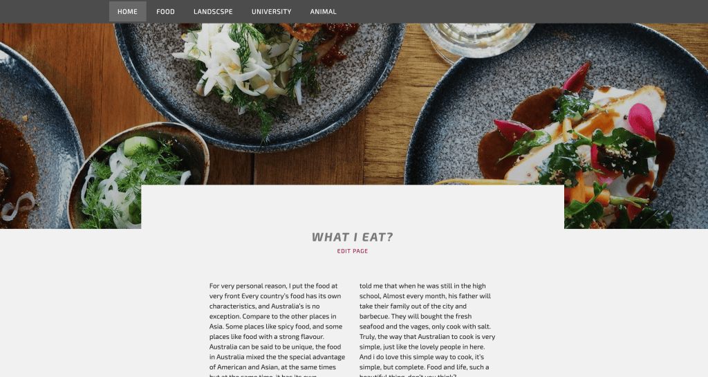
I also used a clear and simple background for each theme as a head image. When people browse the rest of the homepage, they can have a specific understanding about the theme of each block. For all the head image I choose, the most important part is to make the content as much as possible with an uncomplicated structural relationship.
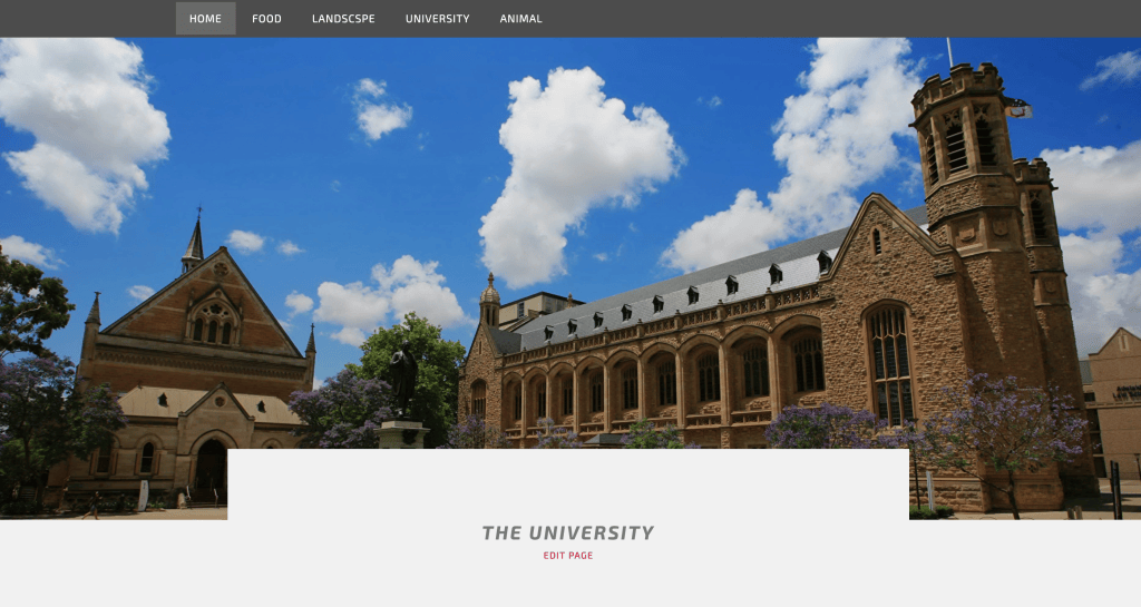
At the process of head image selection, the University part caused a lot of trouble to me, the most of picture about university looks too plump or clear, it’s still a good image for picture, but it’s not good enough to be the head image for my website, so the best solution is to increase the contrast of the image (Rosenfeld, 2014), so I use Photoshop to help me through.
User Interface Design
Because the entire site uses a minimalist style, I need to make a decision about my website layout. According to a document on aesthetic psychology, simple colour blocks and a linear layout are simpler and easier to read than a branch layout (Valentine, 2015). So in the overall web page layout, I chose a linear structure, which is more convenient for users to understand and use. For me, the most hard way during the development of my web site is to connect each seperate block together, at first, I try to blur the top and bottom of each head image and connect them smoothly, but because each of these have completely different colour, The layout of the entire site looks very messy. In the end, I decided to use the ‘camera filter’ type connect each of different topic, It work just like camera, every time you press the shutter, the scenery you get is different, which is a good way to dilute the difference between two different themes.
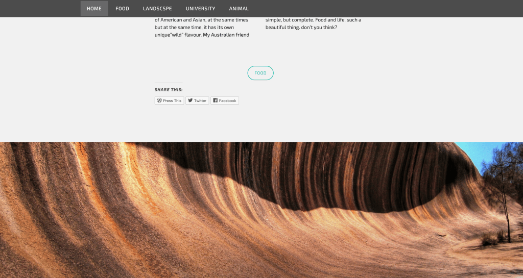
In General, such a design will increase the overall layering and readability of he website, and make the transition between each page are not soo blunt (Grigorik, n.d.).
Since the homepage of this website is only an overview of the specific content, I did not consider adding a sidebar during the development process. I only keep the guide bar always appear on the top and add some small tool on the bottom to increase the operability of my home page.
User experience design
Social media is getting more and more famous now days, it is a good idea to connect social media account with the website. I choose to embedded the digital platform as a small functional tool in the sidebar of each specific pages through the development process.
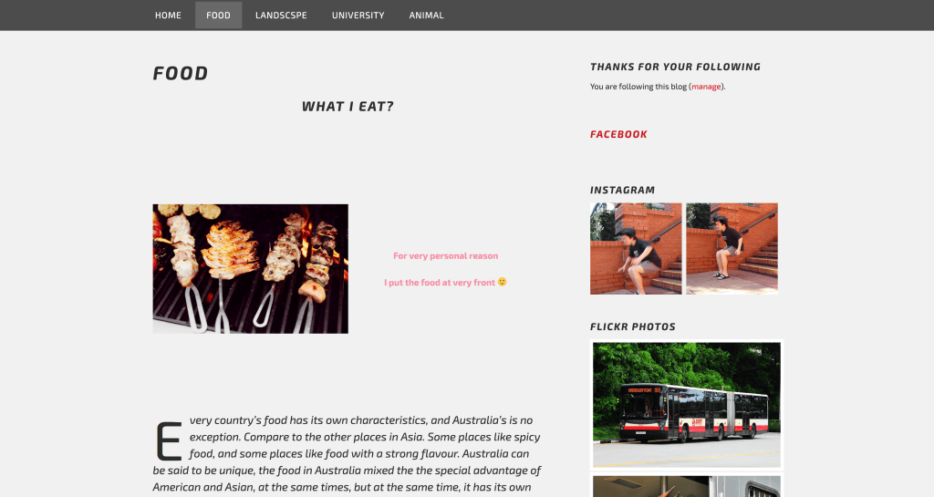
Obviously, the speed and convenience of social media is much higher the original website editors (Mayer-Schönberger and Cukier, 2014). Compare with the complex website format and verification, social media is the tool which truly not being affected by the location you are (Veletsianos, n.d.). But also due to its convenience, most of message it uploaded has not been filtered and summarised. That’s the reason I only decided add the image uploaded from my social account. This section is design for users who want to know the daily life in Australia. These small tools will summarise the update from my social account and reference to my website, it Provide more detailed information for my site and without being affected by the social accounts. I also topping my website URL in each of my social account, it will make the user current for my social media to my website. Once I connect the social account and the website, the user browsing experience increasing, the way to visit my website also gradually diversified.
Audience Metrics
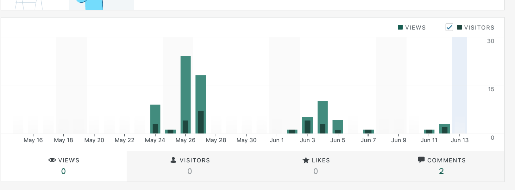
According to the statistics given by the wordpress.com, from May 24 to Jun 13, there are total of 77 people view my website, my facebook account received 2 new friend applications, these phenomena confirm the change I work on website. After I analysing the specific website update note, I found that between May 24th to 27th, which is the most highest view of my website, I replace the old homepages layout to what I use right now. The new layout is now concise to the old one and it more likely to guide user to the exactly page. In the comments given from my classmate each week, there are many people hope I increase the functionality of the subpage and make the connect of image page more smoothly. After the update before 27th, I focused on improving the user experience of the subpages and the construction of social accounts, so the view of my site did not change too much, but on the afternoon of June 7, my facebook received a new friend request, it makes me very excited, this represent my website already has ability to connect my social account.
Future Directions and Development
Through this semester study, I understand that a good website needs to have pictures and layout as support, then increase the interaction with the user. I still wants to follow the original design of my website to show peopler the version of Australia from an international students eyes. Right now, the layout of the subpages is still slightly messy, so I will focus on increase the layout of the subpage in the rest of few week, I also wants create a new sub page which built on Prue HTML code after I learn the HTML program in semester 2. I wall use this page for the display wall for the picture from my social account, and directly link to the target media. It will be a long press, but I am working on it.
Reference list
- 1. Grigorik, I. (n.d.). High-performance browser networking.
- 2. Mayer-Schönberger, V. and Cukier, K. (2014). Big data. Boston: Mariner Books.
- 3. Rosenfeld, A. (2014). Digital Picture Processing. Elsevier Science.
- 4. Valentine, C. (2015). The experimental psychology of beauty. London: Routledge.
- 5. Veletsianos, G. (n.d.). Social media in academia.
By Yuheng Ye